Radio
The radio input is very similar to the dropdown especially for simple use-cases.
ts
const Radio = {
    type: "radio",
    value: "test",
    options: [
        {name: "First", value: 33},
        {name: "Another", value: "test"},
        {name: "Something", value: 66},
        {name: "Last", value: "last"}
    ]
}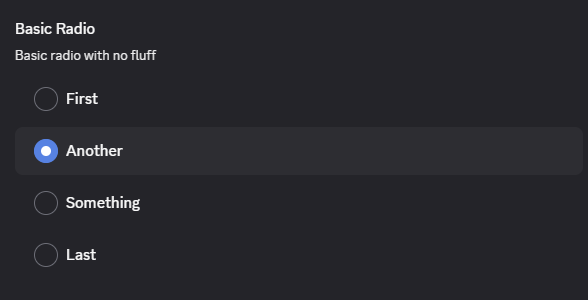
A key feature here is that the label does not need to match the value or even be of the same type.
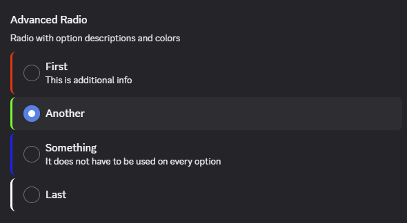
Advanced
The radio input itself does not have advanced options, but the individual options do. They can add both a color and description optionally.
ts
const RadioAdvanced = {
    options: [
        {name: "First", value: 33, description: "This is additional info", color: "#ff0000"},
        {name: "Another", value: "test", color: "#00ff00"},
        {name: "Something", value: 66, description: "It does not have to be used on every option", color: "#0000ff"},
        {name: "Last", value: "last", color: "#ffffff"}
    ]
}