Modals
Modals are elements that overlay the main screen in the center, usually darkening the rest of the page behind them. These are often used to get user input or display important information.
Basic Modals
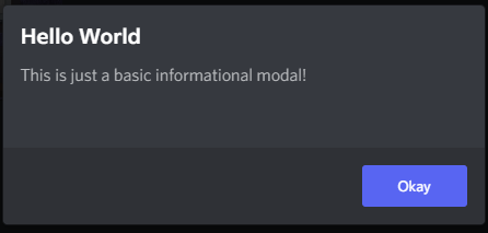
The BdApi.UI.alert() method allows you to create and display a simple yet extensible informational modal. Its signature is alert(title, content).
The most straightforward way to use it, is to just use strings.
BdApi.UI.alert("Hello World", "This is just a basic informational modal!");Result
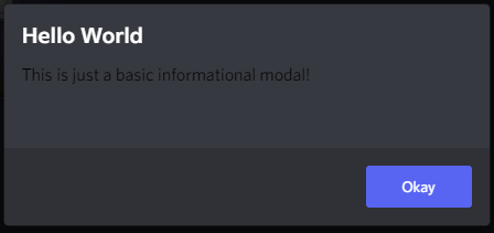
You can also pass in a react element for content but not for title. However, this means you are on your own for functionality and styling. In the last example we saw that the content text was colored and themed properly. But let's try just wrapping a string in a react element.
BdApi.UI.alert("Hello World", <div>This is just a basic informational modal!</div>);Result
And since we are able to use react here for content, it also allows us to pass in a whole tree of elements or custom components. This allows for some very interesting alert possibilities.
function MySearchInput(props) {
return <input
type="text"
placeholder={props.placeholder || "Search..."}
onChange={props?.onChange}
/>;
}
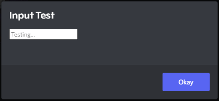
BdApi.UI.alert(
"Input Test",
<MySearchInput
placeholder="Testing..."
onChange={event => console.log(event)}
/>
);Result
Console
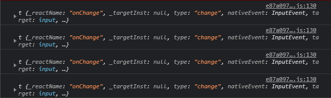
Important to note for later that alert returns a unique modal ID used internally by Discord. We won't be going over its usage here--it's safe to ignore--but may be covered by advanced guides.
Confirmation Modals
Under the covers, alert makes use of showConfirmationModal. This one is an even more extensible and useful helper function. Similar to alert this has a title and content parameter that accept the same types as before. It's full signature is showConfirmationModal(title, content, options = {}). For a full list of options check the api reference. We'll be going over some of the more useful ones here.
BdApi.UI.showConfirmationModal("Hello World", "This is just a basic confirmation modal!");Result
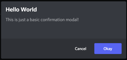
Looking at the result of this one, we can see there is an additional "cancel" button. We can change the text of both of those buttons as well as respond to either of them being clicked using the options in this example.
function MySearchInput(props) {
    return <input
                type="text"
                placeholder={props.placeholder || "Search..."}
                onChange={props?.onChange}
            />;
}

BdApi.UI.showConfirmationModal(
    "Input Test",
    <MySearchInput
        placeholder="Find..."
        onChange={event => console.log(event)}
    />,
    {
        confirmText: "Search",
        cancelText: "Nevermind",
        onConfirm: () => console.log("Pressed 'Search'"),
        onCancel: () => console.log("Pressed 'Nevermind' or escape")
    }
);
Result
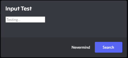
Here clicking Search will close the modal and call the onConfirm function we passed. Similarly clicking Nevermind will call onCancel. If the user exits the modal either by pressing escape on their keyboard or by clicking outside of the modal on the dark background, onCancel will also be called in this case.
Much like alert the function returns a unique modal ID.
Invite Modals
BetterDiscord provides an easy API for opening Discord's native invite modal using normal invite codes.
BdApi.UI.showInviteModal("XXXXXX")